You signed in with another tab or window. Reload to refresh your session.You signed out in another tab or window. Reload to refresh your session.You switched accounts on another tab or window. Reload to refresh your session.Dismiss alert
{{ message }}
Repository navigation
fix(web): Usage cost bars no longer wrap into a half-width column - #31456
On a normal or wide window, the Usage page's "Cost by type" legend wraps, and "Output" drops to a second line. On a narrow window it fits on one line. Making the window bigger makes it look worse.
The section holding the share bars switches to two columns at lg (lg:grid-cols-2). That second column is only for "Cost by speed", which only appears for users with fast or ultrafast spend. Everyone else gets "Cost by type" alone in the left half of an empty grid, about 464px wide, and the four-item legend wraps. Below lg, the grid is one column and the bar gets the full width. When "Cost by speed" does show, both bars are half width and the "Cost by type" legend still wraps.
Change
Drop the lg two-column layout so the share bars always stack at full width, the same layout narrow windows already use. That's a one-line class change in UsagePage.tsx. The "Tokens by type" bar on the Tokens tab had the same half-width issue and is fixed too.
Scope and approval
No prior issue: this is a very small, focused fix of an obvious bug, so it falls under the small-fix exemption. The legend wraps more on wider windows than on narrower ones, and the fix is a single class change. No behavior, data, or settings change.
I searched issues and PRs for this and found no duplicate. #31392 moves this block to the bottom of the overview without changing its classes, so whichever lands second needs a trivial rebase.
Verification
Web dev server (vp run dev) on a seeded copy of real usage data, 1400×1050 viewport, dark theme, headless Chromium at 2× scale. Section widths were measured in the page. vp run check:changed passes (format, lint, knip, typecheck, react compiler).
Past 24h (no fast-mode spend). Before: the bar is 464px wide and the legend wraps. After: 976px wide, one line.
Before
After
30 days (with "Cost by speed"). Before: both bars are half width and "Cost by type" wraps. After: both are full width and stacked, each on one line.
Before
After
Not checked: the desktop Electron shell (it renders the same web component) and mobile, which has its own native Usage screen and isn't affected.
Created with Claude Opus 5.5 in Claude Code (running in T3 Code).
The share-bar section switched to two columns at lg, so on wide windows
"Cost by type" sat alone in the left half and its legend wrapped, while
narrow windows showed it full width on one line. Stack the bars at full
width at every size.

Co-Authored-By: Claude Opus 5.5 <noreply@anthropic.com>
Macroscope's review found this PR approvable — Usage token and cost bars now occupy full-width rows instead of a two-column layout on large screens. The change affects presentation only, leaving usage calculations and billing behavior unchanged.
You can add or adjust custom eligibility rules. Learn more.
This is a small layout fix that makes the Usage cost bars span the full width. No behavioral or data risk is evident, so it is ready to merge.
Pre-merge checks: 4
Check name
Status
Explanation
Title check
The title clearly summarizes the main change: the Usage cost bars no longer use a half-width column.
Linked Issues check
Check skipped because no linked issues were found for this pull request.
Out of Scope Changes check
Check skipped because no linked issues were found for this pull request.
Description check
The description includes all required sections. It explains the problem and change, justifies the scope, and reports focused verification results with before-and-after screenshots and unchecked enviro…
Full details: Description check
Explanation
The description includes all required sections. It explains the problem and change, justifies the scope, and reports focused verification results with before-and-after screenshots and unchecked environments.
Finishing Touches
Generate unit tests (beta)
Create a new PR
Autofix · Keep fixing CodeRabbit findings and required CI, and resolving merge conflicts
Reviewing files that changed from the base of the PR and between 4884cc8 and fa079f6.
Files selected for processing: 1
apps/web/src/components/usage/UsagePage.tsx
Files skipped from review as they are similar to previous changes: 1
apps/web/src/components/usage/UsagePage.tsx
Included review availability: This review used your included allowance. Your plan provides up to 10 included reviews per hour; 9 remain after this review.
verified unchanged head fa079f63a39e044426f8bbef1aaf2c3ba8fc96b2 against github/main at 48a383ca6fea84bf31b71433886b783364857eb3 on a linux boat vm. used separate checkouts, vp i, one real dev server at a time, and the repo’s playwright with /usr/bin/google-chrome. no mocks, fixtures, replay provider, or seeded database.
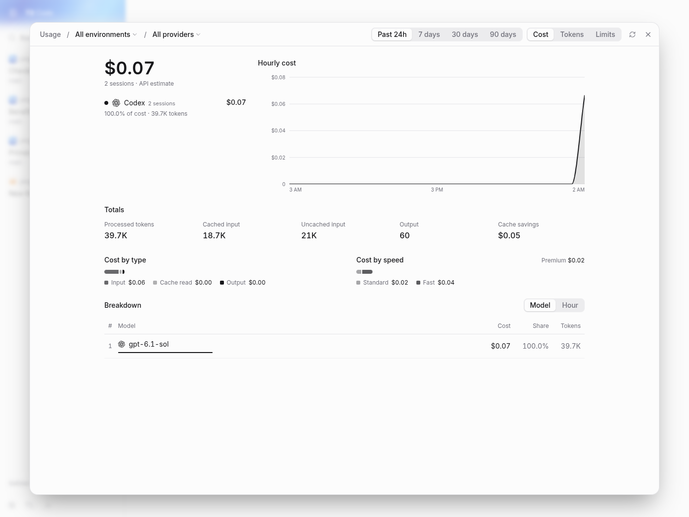
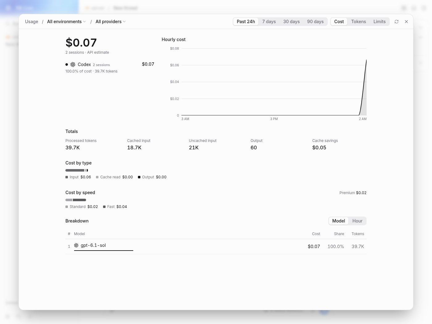
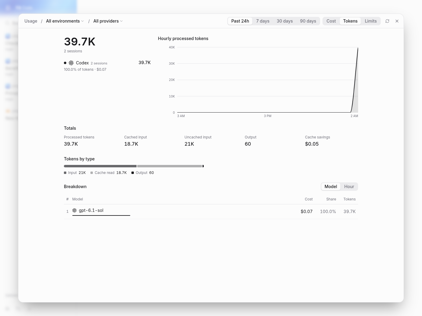
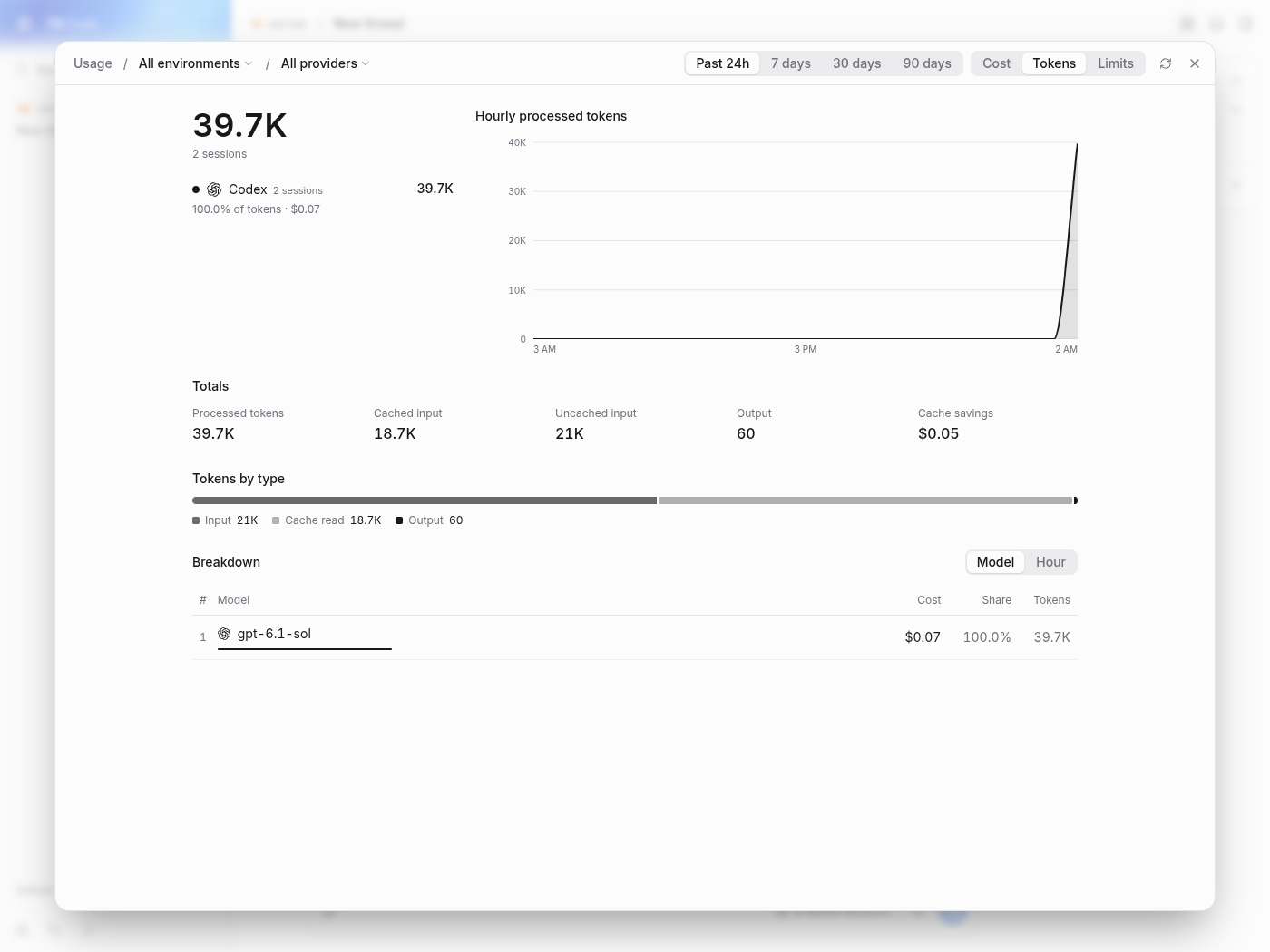
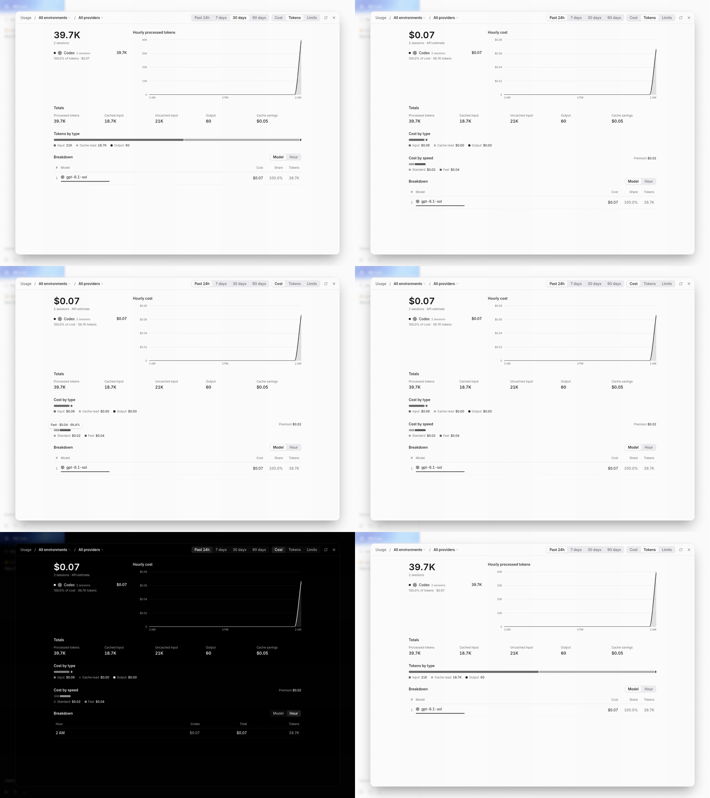
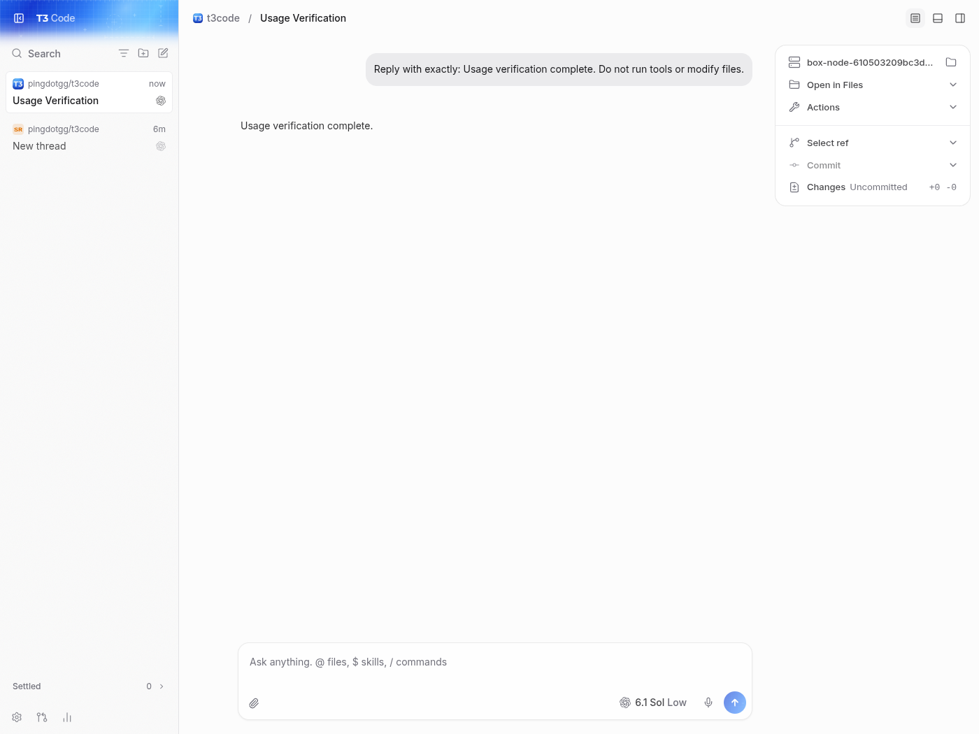
created a project pointing to the real repository through the app. completed standard and fast gpt-6.1-sol turns through the composer using the local provider proxy. the matching before/after captures use the same real transcripts: 2 sessions, 39.7k tokens, and $0.07 estimated cost.
at 1400×1050, main’s cost-by-type, cost-by-speed, and tokens-by-type rows measured 464px inside a 976px section. on the pr, each measured 976px; the cost rows stack vertically.
at 900×1050, all three rows remained 802px on both commits.
exercised cost/tokens switching, segment tooltips, 24h/7-day periods, model/hour breakdown, and hiding/restoring codex in the provider filter. checked the dark theme too.
created another project/thread through the pr’s web client and completed another real gpt-6.1-sol turn. after refresh/reload, usage increased to 3 sessions / 59.4k tokens / $0.09.
vp run check:changed 3a8c250cb0c8056f2f563091fd412fe5db809fa1 passed through blacksmith-check: format, lint, both knip checks, affected typechecks, and react compiler coverage. the worker needed the pr’s parent history fetched before the comparison could run. the existing head also has 31 successful forge checks.
main, cost rows:
pr, matching cost rows:
main, tokens:
pr, matching tokens:
at this small spend, the colored cost segments remain shorter than their tracks on both commits. that existing segment-sizing behavior is separate from this pr’s grid layout.
Not verified
native ios/android clients and the electron shell were not run on this linux vm. remote/relay connections and other providers were not exercised. codex produced input/cache-read/output usage, so the exact four-item legend wrap involving cache-write usage was not reproduced; the half-width layout itself was reproduced and its correction measured with real usage. no code changes or pushes were needed.
This branch has not been deployed
No deployments
This file contains hidden or bidirectional Unicode text that may be interpreted or compiled differently than what appears below. To review, open the file in an editor that reveals hidden Unicode characters.
Learn more about bidirectional Unicode characters
size:XS0-9 changed lines (additions + deletions).vouch:unvouchedAuthor is not yet trusted in the VOUCHED list.
2 participants
Add this suggestion to a batch that can be applied as a single commit.This suggestion is invalid because no changes were made to the code.Suggestions cannot be applied while the pull request is closed.Suggestions cannot be applied while viewing a subset of changes.Only one suggestion per line can be applied in a batch.Add this suggestion to a batch that can be applied as a single commit.Applying suggestions on deleted lines is not supported.You must change the existing code in this line in order to create a valid suggestion.Outdated suggestions cannot be applied.This suggestion has been applied or marked resolved.Suggestions cannot be applied from pending reviews.Suggestions cannot be applied on multi-line comments.Suggestions cannot be applied while the pull request is queued to merge.Suggestion cannot be applied right now. Please check back later.


 github-actions
Bot
added
vouch:unvouched







Problem
On a normal or wide window, the Usage page's "Cost by type" legend wraps, and "Output" drops to a second line. On a narrow window it fits on one line. Making the window bigger makes it look worse.
The section holding the share bars switches to two columns at
lg(lg:grid-cols-2). That second column is only for "Cost by speed", which only appears for users with fast or ultrafast spend. Everyone else gets "Cost by type" alone in the left half of an empty grid, about 464px wide, and the four-item legend wraps. Belowlg, the grid is one column and the bar gets the full width. When "Cost by speed" does show, both bars are half width and the "Cost by type" legend still wraps.Change
Drop the
lgtwo-column layout so the share bars always stack at full width, the same layout narrow windows already use. That's a one-line class change inUsagePage.tsx. The "Tokens by type" bar on the Tokens tab had the same half-width issue and is fixed too.Scope and approval
No prior issue: this is a very small, focused fix of an obvious bug, so it falls under the small-fix exemption. The legend wraps more on wider windows than on narrower ones, and the fix is a single class change. No behavior, data, or settings change.
I searched issues and PRs for this and found no duplicate. #31392 moves this block to the bottom of the overview without changing its classes, so whichever lands second needs a trivial rebase.
Verification
Web dev server (
vp run dev) on a seeded copy of real usage data, 1400×1050 viewport, dark theme, headless Chromium at 2× scale. Section widths were measured in the page.vp run check:changedpasses (format, lint, knip, typecheck, react compiler).Past 24h (no fast-mode spend). Before: the bar is 464px wide and the legend wraps. After: 976px wide, one line.
30 days (with "Cost by speed"). Before: both bars are half width and "Cost by type" wraps. After: both are full width and stacked, each on one line.
Not checked: the desktop Electron shell (it renders the same web component) and mobile, which has its own native Usage screen and isn't affected.
Created with Claude Opus 5.5 in Claude Code (running in T3 Code).
🤖 Generated with Claude Code