Repository navigation
Conversation


 github-actions
Bot
added
vouch:trusted


ApprovabilityVerdict: Approved at Macroscope's review found this PR approvable — Composer notices place action buttons below wrapping titles in narrow layouts and include the title in description popovers. The changes are presentation-only, with existing action and dismissal behavior unchanged. You can add or adjust custom eligibility rules. Learn more. |

cb2ce53 to
df3c346
Compare

bb68b1c to
e96c85f
Compare

|
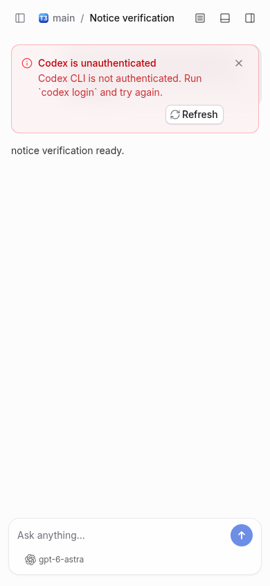
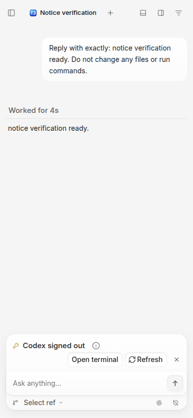
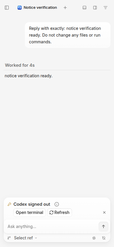
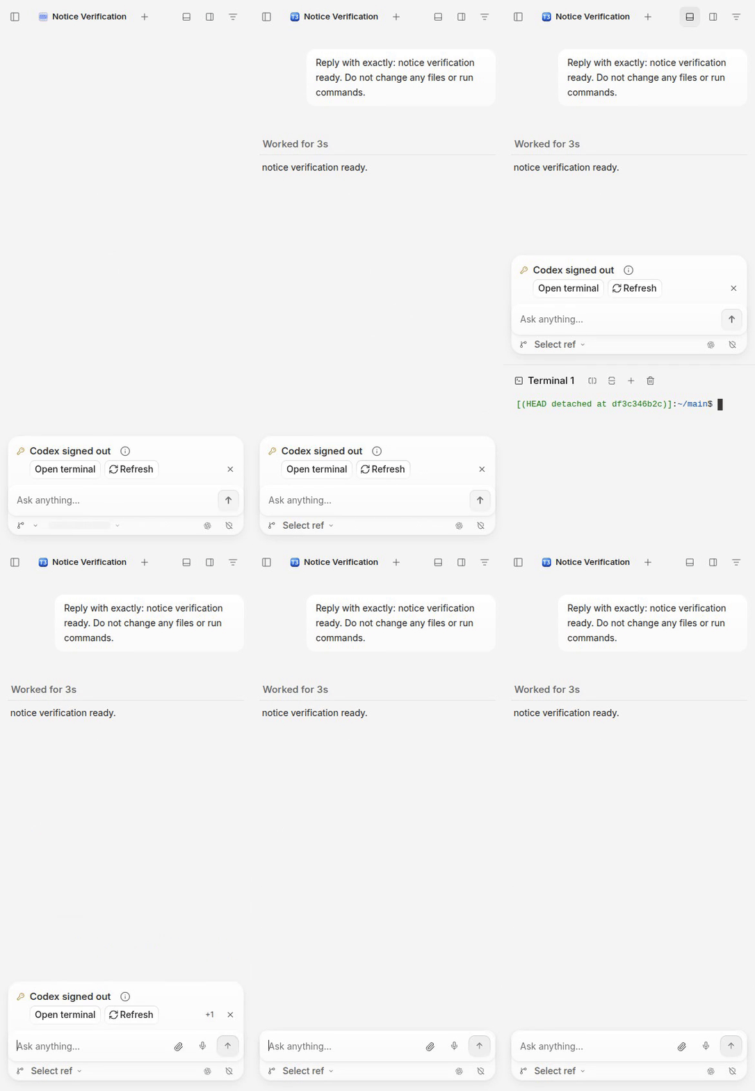
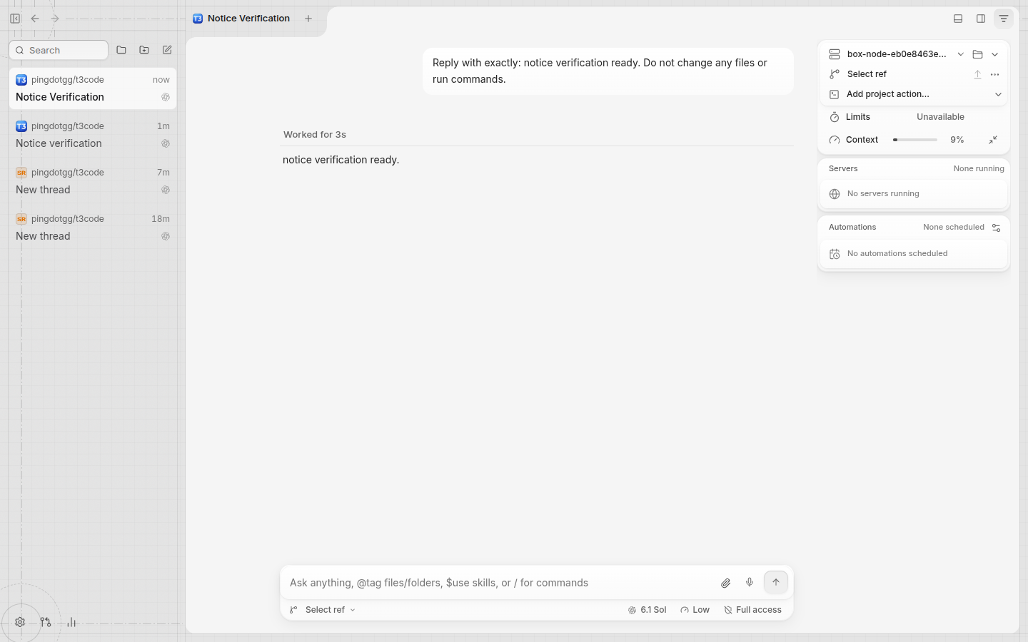
Note Written by Verified in a real dev environmentverified exact head started because this PR stacks on the composer redesign, also ran its unchanged parent stopped each server before starting the next. installed the exact PR head and ran it with an explicit isolated home. with matching data and viewport, both the title and wrapped actions now start at x=46; dismiss remains at the trailing edge: also exercised the real notice controls: Refresh sent the provider-refresh WebSocket request and completed a fresh Codex probe; Open terminal opened a working shell; dismiss removed the notice. short runtime transcript: restored the configured Codex home and completed fresh inspected the captures and checked playback and seeking of the uploaded recording. no mocks or demo data were used. Not verifiednative iOS/Android clients, the Electron shell, macOS/Windows, right-to-left layouts, and remote/relay/tunnel connections were not exercised on this linux vm. the narrow capture is the real web client at phone width. providers other than Codex were not exercised. no new automated checks were run for this verification-only pass. |
df3c346 to
9fa8150
Compare

Dismissing prior approval to re-evaluate 93ae428
github-actions
Bot
added
size:XXL
93ae428 to
89d31d6
Compare
github-actions
Bot
added
size:M
89d31d6 to
e6eccf3
Compare
Dismissing prior approval to re-evaluate e6eccf3
shivamhwp
changed the title
Dismissing prior approval to re-evaluate a0eab15
shivamhwp
changed the title


On a narrow composer a notice's buttons wrap to a second line. That line
was pushed to the right edge, so the buttons sat under nothing. They now
start under the title, and the dismiss button and the "+N" count stay at
the row's end. A title too long for the first line also stays beside its
icon instead of dropping below it.

Co-Authored-By: Claude Fable 5.2 <noreply@anthropic.com>
The X and the +N count now sit beside the title, and a notice with a
description shows one details button that carries the title too.

Co-Authored-By: Claude Opus 5.5 <noreply@anthropic.com>
…e title

Below 480px a notice shows its title and dismiss on the first line, then
its description in full and its buttons, all from the title's edge. The
details button is gone there because nothing is cut off.

Co-Authored-By: Claude Opus 5.5 <noreply@anthropic.com>
Below 480px the description is hidden again, and a body-size notice's
icon is as large as its dismiss button.

Co-Authored-By: Claude Opus 5.5 <noreply@anthropic.com>
a0eab15 to
0435fd2
Compare
Below 480px a notice is a header row (icon, title, +N and dismiss) over a
right-aligned footer of its buttons, like ComposerRequestCard. Wider
notices keep the one-line status row and its 12px icon.

Co-Authored-By: Claude Opus 5.5 <noreply@anthropic.com>
Dismissing prior approval to re-evaluate 877fe8f
Co-Authored-By: Claude Opus 5.5 <noreply@anthropic.com>
Dismissing prior approval to re-evaluate eba67df
shivamhwp
changed the title


Note
🤖 Claude Fable 5.2 on behalf of Shivam
On a phone-width composer, a notice with buttons (for example "Codex signed out" with Open terminal and Refresh) wrapped its buttons to a second line with the dismiss button after them. The dismiss button sat away from the title it closes, and a long title dropped below its icon with two identical ⓘ buttons.
Below 480px of card width a notice now follows
ComposerRequestCard, the approval card's layout:gap-2, ending under the dismiss button.The description and its ⓘ stay hidden at that width, as they were. The icon, the title's first line and the dismiss button share one centre line.
At 480px and wider, the one-line status row is unchanged. The desktop screenshot below is pixel-identical at base and head.
Stacks on
maria/redesign/2-composer-timeline.The dev server with an empty T3 home, in headless Chromium at a phone size. Before (layer 2 at 5604040):

After (eba67df):

Every notice shape, from the real

ComposerBannerStackrendered alone in headless Chromium at a 390px viewport: two buttons with dismiss, dismiss only, one button, no actions, a long title, and a stack with two more notices. Before:After:

Measured centres of the icon, the title's first glyph and the dismiss icon are within 1px of each other in every shape, at 340, 366, 520 and 728px and at the phone viewport.
vp run check:changedat eba67df: format, lint, knip, graphql, typecheck (41 packages) and the React compiler check passed. In the full test run, twoSecretSourceInput.browser.test.tsxcases timed out under load. They passed when rerun alone, as didComposerBannerStack.browser.test.tsx. No test added: this is a layout fix, and the captures above are its proof.Not shown: a physical phone, and right-to-left layouts (the change uses logical start and end properties only).
Claude Fable 5.2, Claude Code via T3 Code.
🤖 Generated with Claude Code