


A pure Jetpack Compose color picker library — a from-scratch rewrite of the View/XML-based ColorPickerKotlin library, with the same set of color windows and composed pickers, but built entirely with Compose Canvas, gestures, and state instead of View, Bitmap caching, and XML attributes.
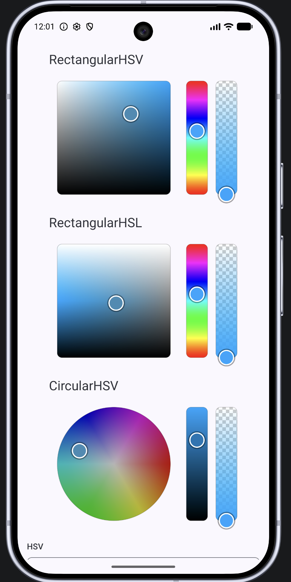
:colorpicker— the library module. No Material dependency; everything is built onandroidx.compose.foundation/ui.:app— a demo app showing all three pickers sharing one color, with a value text field, format-switch buttons, and a random-color button.
Add the JitPack repository.
settings.gradle.kts (Kotlin DSL)
dependencyResolutionManagement {
    repositories {
        google()
        mavenCentral()
        maven { url = uri("https://jitpack.io") }
    }
}
settings.gradle (Groovy DSL)
dependencyResolutionManagement {
    repositories {
        google()
        mavenCentral()
        maven { url 'https://jitpack.io' }
    }
}
Add the dependency.
build.gradle.kts (Kotlin DSL)
dependencies {
    implementation("com.github.slaviboy:colorpicker:2.0.0")
}
build.gradle (Groovy DSL)
dependencies {
    implementation 'com.github.slaviboy:colorpicker:2.0.0'
}
Note the artifact id is
colorpicker(the module name), not the repo nameColorPickerCompose— this repo publishes the:colorpickermodule directly via JitPack.
Alternatively, if you'd rather vendor the source directly: copy the colorpicker/ folder into your own multi-module project and include(":colorpicker") in settings.gradle.kts.
The fastest way to get a working picker is one of the three pre-built, fully composed pickers:
import com.slaviboy.colorpicker.picker.RectangularHsvColorPicker
import com.slaviboy.colorpicker.picker.RectangularHslColorPicker
import com.slaviboy.colorpicker.picker.CircularHsvColorPicker
import com.slaviboy.colorpicker.state.rememberColorPickerState

@Composable
fun MyScreen() {
    val state = rememberColorPickerState(initial = Color(0xFF3F8CB5))

    RectangularHsvColorPicker(state = state)
    // or: RectangularHslColorPicker(state = state)
    // or: CircularHsvColorPicker(state = state)

    // Read the color wherever you need it:
    Box(Modifier.background(state.color))
}
Each of the three pickers combines a 2D "window" (a square or wheel) with a Hue slider (or Value slider, for the circular one), an Alpha slider, and an optional value text field — see Anatomy of a picker below for what each one looks like and which parameters you can tweak.
ColorPickerState is the one object every picker (and every text field) reads from and writes to. Create it with rememberColorPickerState(initial: Color), and share the same instance across multiple pickers/fields if you want them to stay in sync (this is exactly what the demo app does — drag any one picker and the other two, plus the text field, all move immediately, because they're all just reading the same state):
val state = rememberColorPickerState(Color.Red)

RectangularHsvColorPicker(state = state, showTextField = false)
CircularHsvColorPicker(state = state, showTextField = false)
ColorValueTextField(state = state, format = ColorFormat.Hex)
Canonical fields are hue (0–359), hsvSaturation (0–100), value (0–100), and alpha (0–255) — everything else (hsl, hwb, cmyk, hex, the final color: Color) is computed on every read from those four, so there's never a stale copy to keep in sync.
Useful reads:
| Property | Type | Meaning |
|---|---|---|
state.color |
Color |
the final RGBA color, ready to use anywhere Compose wants a Color |
state.hue / hsvSaturation / value |
Int |
canonical HSV |
state.hslSaturation / lightness |
Int |
derived HSL saturation/lightness (not the same numbers as HSV's saturation — see below) |
state.rgba / hwb / cmyk |
data class | derived color models |
state.hex / hexa |
String |
"#RRGGBB" / "#RRGGBBAA" |
Useful writes — call whichever matches how you got the new value:
state.setHue(210)
state.setAlpha(128)
state.setSaturationValue(s = 60, v = 80)       // HSV square
state.setSaturationLightness(s = 60, l = 40)    // HSL square
state.setColor(Color(0xFFAABBCC))               // full overwrite, e.g. a "random color" button
state.setHexString("#AABBCC")                   // returns false and leaves state untouched if invalid
Why HSV-saturation ≠ HSL-saturation: the same color can have very different saturation numbers in the two models — e.g.
HSV(0°, 50%, 100%)is the same color asHSL(0°, 100%, 75%). If you're reading/writing saturation, make sure you're using the pair of properties/setters that matches the model you mean (hsvSaturation+value, orhslSaturation+lightness).
Every picker is just a small Column/Row of independent composables from com.slaviboy.colorpicker.window, so you can also build your own layout instead of using the 3 pre-built pickers:
| Composable | Original library equivalent | Drives |
|---|---|---|
HueSaturationWheel |
CircularHS |
hue (angle) + HSV saturation (distance from center) |
SaturationValueSquare |
RectangularSV |
HSV saturation (x) + value (y) |
SaturationLightnessSquare |
RectangularSL |
HSL saturation (x) + lightness (y) |
HueSlider |
SliderH |
hue |
ValueSlider |
SliderV |
HSV value |
AlphaSlider |
SliderA |
alpha |
All of them take the same shape of parameters: (state, modifier, style: SelectorStyle, ...). Building RectangularHsvColorPicker yourself would look like:
Column {
    Row(horizontalArrangement = Arrangement.spacedBy(12.dp)) {
        SaturationValueSquare(state, Modifier.size(220.dp))
        HueSlider(state, Modifier.size(28.dp, 220.dp))
        AlphaSlider(state, Modifier.size(28.dp, 220.dp))
    }
    ColorValueTextField(state, ColorFormat.Hsv, Modifier.fillMaxWidth())
}
Custom combinations work too — e.g. a wheel with no sliders at all, or a square paired only with an alpha slider. Every window is fully independent; nothing needs to be "attached" to anything else (there's no Updater to configure, unlike the original library) — they just all read the same ColorPickerState.
SelectorStyle replaces the original's XML attributes (selector_radius, selector_stroke_width, border_color, ...):
val style = SelectorStyle(
    radius = 10.dp,
    strokeWidth = 2.dp,
    strokeColor = Color.White,
    borderColor = Color.Black.copy(alpha = 0.2f),
    borderWidth = 1.dp,
)

SaturationValueSquare(state, Modifier.size(220.dp), style = style)
The main 2D windows (HueSaturationWheel, SaturationValueSquare, SaturationLightnessSquare) are always square (they bake in Modifier.aspectRatio(1f)), so sizing them is just Modifier.size(220.dp) or Modifier.fillMaxWidth().aspectRatio(1f).
A single text field composable can display/edit the color in any of the formats the original library supported — full color models or a single channel:
ColorValueTextField(state = state, format = ColorFormat.Hex)
ColorValueTextField(state = state, format = ColorFormat.Rgba)
ColorValueTextField(state = state, format = ColorFormat.HsvChannel.H)  // just the Hue number
It's built on BasicTextField (no Material dependency in :colorpicker), so to get Material 3 chrome (an outline, a label, etc.) in your app, pass your own decorationBox:
ColorValueTextField(
    state = state,
    format = ColorFormat.Hex,
    decorationBox = { innerTextField ->
        Box(Modifier.border(1.dp, MaterialTheme.colorScheme.outline, RoundedCornerShape(8.dp)).padding(12.dp)) {
            innerTextField()
        }
    }
)
Typing a valid value updates state (and therefore every picker sharing it) live, on every keystroke. An invalid or partially-typed value is shown as-is without touching state, and snaps back to the last valid formatted value when the field loses focus (tap elsewhere, or press the keyboard's Done action).
:app (ColorPickerDemoScreen.kt) reproduces the original library's sample app: all three pickers stacked and sharing one ColorPickerState, a value text field with RGBA/HSV/HEX format-switch buttons, and a "Random Color" button. Run it with ./gradlew :app:installDebug or from Android Studio.
Every window, picker, and the text field has an @Preview composable at the bottom of its file, so you can see each one directly in Android Studio's preview pane without running the app.
For anyone extending this library, a few things are worth knowing:
- One reactive state object replaces the original's
ColorConverter+ColorHolder+Updater. The original manually dispatchedupdate()/redraw()calls to every attachedViewbased on runtime type checks (is SliderH,is RectangularSV, ...). Here, every window composable just reads theColorPickerStatefields it needs — Compose recomposition does the propagation automatically, so there's no dispatch code to maintain. - The wheel, SV-square, and SL-square backgrounds are each 2–3 sequential
Brushgradient draws, not the original's bitmap-caching +PorterDuff/Xfermodelayering (which existed mainly to work around oldView/Canvasperformance limits) or a manual per-degree sweep. These were each verified algebraically to reproduce the exact HSV/HSL math, not just visually approximate it. - Gestures are hand-rolled (
Modifier.dragToMoveincomponent/GestureModifiers.kt) instead ofdetectDragGestures, because the latter'sonDragStartonly fires after touch-slop movement — this library moves the selector immediately on the initial touch-down, matching the original. - Slider padding is asymmetric on purpose: the full selector padding is only reserved along the slider's main (drag) axis; the cross axis only reserves the border width, so a narrow slider's track doesn't collapse to zero width under its own selector's padding.
See colorpicker/src/main/java/com/slaviboy/colorpicker/ for the full package layout (model → color math, state → ColorPickerState, component → reusable gesture/draw building blocks, window → the 6 concrete pickers, picker → the 3 composed pickers, textfield → the value text field).
./gradlew :colorpicker:test
Covers the color-model conversion math (ColorConverter), the pixel↔value/angle math (RangeMath), and ColorPickerState's setters.